
Introduction
he Universal Data Loader (UDL) is the critical gateway for enterprise users to import data into our platform. However, the legacy experience was a significant productivity drain and a primary source of user churn (CSAT 3.2/5). It relied on repetitive, manual inputs housed within a static, "black box" UI that offered no feedback until it was too late.
As the Lead Product Designer, I owned the end-to-end redesign of the ingestion workflow. My strategy focused on shifting the user mental model from "Manual Data Entry" to "Intelligent Review."
Where Data Meets Decisions

?
The Challenge
For data engineers and business analysts, importing data isn’t just about moving files—it’s about trusting the results. But instead of a smooth pipeline, users faced a maze: ambiguous steps, limited validation, no clear error handling, and uncertainty around whether the job succeeded or silently failed.
The "Manual Effort" Bottleneck
The system was "dumb." For every upload, users had to manually map 50+ columns to schema fields,
even for recurring jobs.
The Pain Point: This high-friction process turned simple data updates into hour-long tasks. Users
felt they were working for the machine, rather than the machine working for them.Non-Informative Legacy UI
The interface lacked feedback. It offered no "Smart Suggestions" or validation during the process.The Pain Point: If a user made one mistake in that long manual process, the system would fail
silently or reject the whole file without explaining why. The UI was a "Black Box" that created
anxiety and wasted time.
Strategic Goal
To move from a Manual Input Model →→ to an AI-Assisted Workflow.
Old Way: User does 100% of the work. System executes.
New Way: AI does 90% of the work. User reviews the remaining 10%.


"
Project Details
Duration
8 Weeks
My Role
Research & Design
"
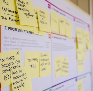
Discovery & Research Strategy
Moving beyond assumptions to evidence-based decision making.
01 Quantitative Validation {Survey data}
I launched an in-app survey to 313 active users to see baseline satisfaction.
Method: In-app intercept survey (N=33 responses).
Key Metric: The tool had a CSAT score of just 3.2/5.
The Finding: Users didn't hate the technology; they hated the process. 35% of comments specifically flagged "Slowness" and "Repetition" as their top frustrations.
02 Mining Customer Signals {User Feedback}
I analyzed 84 user-submitted ideas from our product feedback tool (Aha!) and reviewed 12 months of support tickets.
Method: Thematic clustering using spreadsheet analysis.
The Insight: Users were explicitly asking for automation.
"Why can’t it suggest mappings automatically?"
"I upload the same file every week; why do I have to map 50 columns again?"
Result: This confirmed that Auto-Mapping wasn't just a "nice-to-have"—it was a critical feature.
To justify the investment in AI and automation, I needed to prove that "Manual Effort" was the primary cause of churn. I triangulated data from three specific sources:
03 Competitive Benchmarking {Competitor Data}
I analyzed the onboarding flows of Informatica, Salesforce Data Cloud, and HubSpot.
The Gap: Competitors offered "Wizard-style" flows with inline validation. We were the only platform relying on a "Black Box" upload (no feedback, no validation).
The Opportunity: While competitors offered complex tools for IT pros, we identified an opening to build a "Smart Loader" for business users by leveraging AI to hide the complexity.
Research Summary at a Glance
Theme
Insights (From Users, Survey & Competitors)
Opportunities / Final Outcomes
Performance & Speed
~35% of survey comments flagged slowness. Competitors provide real-time validation & progress indicators.
Optimize system performance, introduce progress tracker, batch processing.
Transparency & Job Management
Users want filtering, inline editing, timestamps, and clearer job states. Survey showed confusion about queued jobs. Competitors offer inline editing & live dashboards.
Add filtering, inline editing, job status column, timestamps, and transparent queue states.
Error Handling & Data Quality
Pain point: weak validation, unclear error logs. Competitors offer real-time validation & troubleshooting guides.
Add detailed error logs, skip bad records, validate formatting, anomaly detection.
_______________________________________________________________________________________________________________________________________________________________________________________________
_______________________________________________________________________________________________________________________________________________________________________________________________
_______________________________________________________________________________________________________________________________________________________________________________________________
_______________________________________________________________________________________________________________________________________________________________________________________________
AI-Powered Assistance
Users explicitly asked for AI-driven recommendations & guidance. Competitors (Profisee, Salesforce Cloud) use AI for mapping & quality checks.
Roadmap: AI-driven auto-mapping, anomaly detection, smart assistant for step-by-step job execution.
_______________________________________________________________________________________________________________________________________________________________________________________________
Job Scheduling & Prioritization
Feedback: users want control over execution order. Competitors allow pausing, stopping, scheduling.
Add job start times, priority queueing, drag-and-drop reordering
_______________________________________________________________________________________________________________________________________________________________________________________________
Notifications & Alerts
Users want proactive alerts. Competitors provide real-time tracking & error alerts.
Implement centralized notifications, real-time alerts for completion/failures/anomalies.
_______________________________________________________________________________________________________________________________________________________________________________________________
Search & Filtering
Manual filtering slows down workflows. Competitors integrate enterprise-scale filtering.
Introduce entity/relationship filters and AI-driven auto-selection.
_______________________________________________________________________________________________________________________________________________________________________________________________
Security & Trust
Credential masking missing; competitors offer RBAC and encryption.
Implement credential masking, RBAC, encryption for cloud credentials.
_______________________________________________________________________________________________________________________________________________________________________________________________
Some users described it as “smooth” or “easy,” but qualifiers (“but slow,” “could improve”) dominate. Negative outliers (“bad”) hurt perception.
Turn baseline usability into delight with speed + clarity + AI features. Quick wins reduce frustration fast.
User Sentiment
"
The Problem Definition
Synthesizing this research, I defined two core friction points:
The "Manual Effort" Bottleneck:
For every upload, users had to manually map 50+ columns. This repetitive grunt work turned simple updates into hour-long tasks.The Visibility Gap (Non-Informative UI):
The interface offered no feedback. If a user made one mistake in that long manual process, the system failed silently. This lack of transparency created "Upload Anxiety."

"
The Solution: "Smart Ingestion"
We redesigned the UDL based on three core design principles: Guide, Validate, and Forgive.
A. Intelligent Auto-Mapping (The "Guide" Principle)
Before: Users manually selected a dropdown for every single column (e.g., 50+ columns).
After: The system now scans the file header. Using fuzzy logic, it automatically suggests mappings (e.g., auto-mapping "Phone_Num" to "Contact Number") with a confidence score.
UI Detail: High-confidence matches are green; low-confidence matches are yellow and require user confirmation.
B. Pre-Flight Validation (The "Validate" Principle)
Before: Validation occurred after the full data load.
After: We introduced a "Sample Preview" step. The system grabs the first 100 rows and validates them instantly.
UI Detail: A "Data Health Score" bar appears at the top. If the score is low (e.g., "60% Health"), users are warned before they commit to the full load.
C. In-Line Error Correction (The "Forgive" Principle)
Before: If a row had an error, the user had to cancel, open Excel, fix the file, and re-upload.
After: We built a spreadsheet-like interface within the browser. Users can double-click a cell highlighted in red, correct the typo, and proceed without leaving the platform.
Design Interaction: "Only show rows with errors" toggle allows users to focus purely on fixing issues.
D. Transparent Progress Feedback
Before: A spinning loader.
After: A granular progress stepper: Uploading > Validating > Transforming > Loading.
UI Detail: Estimated time remaining is displayed (e.g., "approx. 4 mins remaining").
"
Design Evolution: The "Trust Gap"
The Challenge of "The Trust Gap"
The Insight: Users Distrusted the "Black Box"
Despite the efficiency gains, participants hesitated to click "Confirm."
User Feedback: "How do I know the AI didn't map 'Create Date' to 'Modified Date'? If I import this wrong, it ruins my reporting."
The Finding: Total automation created anxiety. Users felt they were losing control over data integrity and feared "Silent Failures."
The Design Iteration: "Glass Box" Transparency
To solve this, I shifted the design mental model from "AI does it for you" to "AI suggests, You confirm."
Confidence Scoring (The Traffic Light System):
I introduced visual indicators next to every mapped field:Green (High Confidence): Exact matches (e.g., Email = Email).
Yellow (Low Confidence): Fuzzy matches requiring review.
"Review by Exception" Filter:
I added a toggle to "Show only Low Confidence Mappings." This allowed users to skip the 45 correct fields and focus only on the 5 questionable ones.
The Result:
This small UI change was the tipping point for adoption. It gave users the psychological safety to trust the tool, knowing that the AI was an assistant, not a replacement for their judgment.
"
Visual Design & Interaction Details
Defining the look and feel of "Confidence."
Since this tool handles dense data, clarity was paramount. I relied on specific UI patterns to reduce cognitive load:
Confidence Badges: We utilized a pill-shaped badge component. High confidence matches used a subtle green background (#E6F4EA) with dark green text (#137333) to signal "Safe to ignore." Low confidence matches used an alert yellow (#FEF7E0) to draw the eye immediately.
The Connection Canvas: To visualize the mapping, I designed a "s-curve" connector line that links Source Columns (Left) to Destination Fields (Right). When a user hovers over a field, the line thickens and highlights, visually confirming the data flow.
Micro-Interactions: When a user fixes an error in the Triage Dashboard, the cell flashes green briefly (Success State) before settling, providing immediate positive reinforcement that the data is now valid.
"
Results & Impact
Measuring success against business goals.
Post-launch, we tracked performance over a 90-day period. The data confirmed we had solved the core friction points:
Efficiency: Average time to complete a data load dropped from 14 mins to 8 mins (25%+ reduction).
Success Rate: First-time import success rate increased from 55% to 82%.
Support Costs: Tickets related to "Import Failure" dropped by 40%, freeing up an estimated 15 engineering hours per month.
"
Retrospective
What I learned and what I would do differently.
1. Trust is a UX Feature
I learned that in AI-driven tools, efficiency without transparency fails. Users would rather spend 1 minute verifying an AI suggestion than 0 minutes trusting a black box. The "Confidence Score" UI was not just a visual flourish; it was the mechanism that allowed users to trust the system.
2. The Cost of "Inline Editing"
Building the Excel-like editor in the browser was engineering-heavy. In hindsight, I would have pushed for a simpler "List View" for errors in V1 to ship faster, as the full grid view delayed the release by two weeks. However, the positive feedback on the grid view suggests the investment paid off in the long run.
The ‘Why’ Behind the Work


This wasn’t just about usability—it was about trust, confidence, and time.
By connecting directly with users and benchmarking real-world standards, I am turning UDL into a tool users want to use—not just have to use.
In the end, it’s about making complex things feel simple. That’s the magic of good UX.